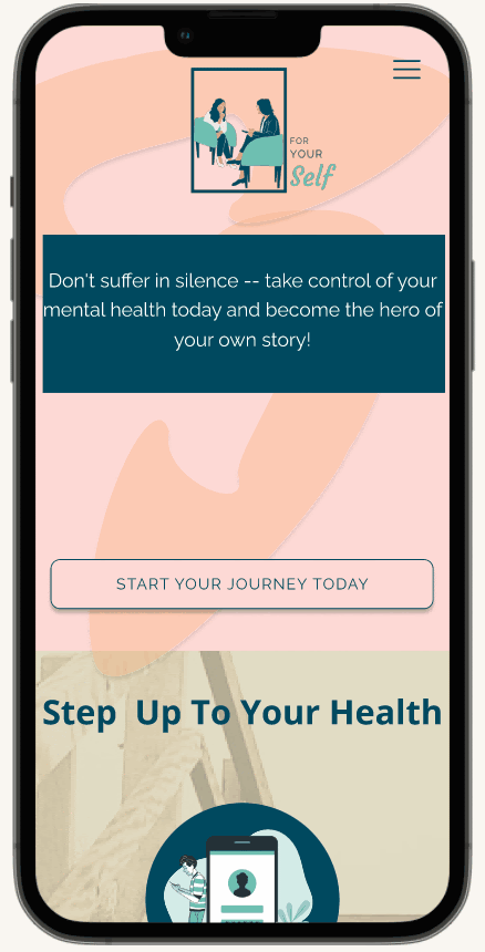
FOR YOUR SELF
BACKGROUND
“Half of all mental health conditions start by age 14, but most cases are undetected and untreated” (MadeOfMillions.com/Stats).
Say what you will about the effects of social media on youth age 12-19, but one positive is that teenagers in 2023 are more aware of the importance of caring for their mental health. Awareness, unfortunately, only begins the solution. Teenagers still need assistance overcoming the stigma of seeking and gaining help, then they need to know how to actually obtain that help.
This is how For Your Self began.
For Your Self is an aggregate source for teens to find help for their mental health. It includes resources to link them to reliable professional help.
MY ROLE
As a former high school teacher, this project was close to my heart. I knew the questions to ask to define the users and their needs so I drafted, distributed, and analyzed the survey.
Because UI and presentation are also my specialty I came up with the primary and iterated design theme and iconography, then created the Google Slide deck.

01 EMPATHIZE
Because we already know some teens’ roadblocks to obtaining mental health care are the stigma and the logistical access, we sought more information and demographics. I wrote a survey and offered it to youth age 12-19 via QR code.
Some key takeaways from this survey include:
-
33% of respondents feel they do not have a trusted adult in their lives
-
50% of respondents would either Google it or wouldn’t even know where to start when accessing mental health resources
-
25% of respondents feel that therapy wouldn’t help them at all


02 DEFINE
PERSONA
Our design team wanted to include the age from of American students in middle and high school, which is generally ages 12-19. This is a wide range of needs, so instead of one proto-persona, we created three -- each with varied needs and goals. We then blended them into one overall persona.
Meet Jenna Dorsey, a 16-year-old 10th grader who, despite having a variety of passionate creative interests, has severe personal doubts. She especially experiences anxiety when sharing her own work and this has led to even more nerves as she thinks about the ever-looming deadline of college applications.
EMPATHY MAP
When further defining Jenna, we identified points we as designers need to consider as we create a resource for her.
-
What do I see?
-
I see way too many papers: homework, college apps, scholarship forms, activity fliers.
-
My friends posting things on Instagram and I wasn’t invited
-
-
What do I do?
-
I listen to music and mix my favorites
-
I am really good at my computer science class
-
-
What do I think and feel?
-
I think a lot about how the pieces of the world fit together and how I might add sounds to it
-
I feel like everyone has the same stress but we don’t talk about it together
-
-
What do I hear?
-
My teachers always reminding me to keep my grades up and study for the ACT and apply for colleges
-
My classmates listening to TikToks and laughing
-
-
Pains
-
I don’t want to ask another adult for help because I am worried they might tell my counselor and will that impact me getting into college?
-
I don’t know how to pay for therapy, especially if I don’t want my parents to know
-
-
Gains
-
I want to make sure I can advocate for myself before I leave for college because what if this gets worse?
-
Maybe I can make friends who have the same concerns that I do.
-
Jenna wants to get assistance in accessing mental health care, but she’s adamant about doing it on her own. Self-advocacy is key, as is removing the stigma.
PROBLEM STATEMENT
After the research phase, we concluded that Jenna Dorsey and other youth/students like her need a site that is accessible without being too geared towards a more older demographic. She wants things explained matter-of-fact without being judged for wanting help. She also wants constant assurance of her privacy.
03 IDEATE
For Your Self as an aggregate of mental health resources isn’t a new concept per se, so we explored a few existing sites such as Better Help and NoCD.com to see what key elements we might seek to integrate into our concept.
We initially brainstormed an ideal site map in Miro. The map pictured here isn’t what we ultimately went with in our first iteration (we focused on Minimum Viable Product for version 1.0). One key point in this iteration was the naming of the topic headings. Other sites had more generic and formal names, but For Your Self is directed at youth and we wanted something more welcoming, casual, and targeted. We kept with the theme of “your” and “my” in order to grant the users more ownership in their mental health journey.
Our team then mapped out a typical user journey for someone like our user Jenna Dorsey. If Jenna is seeking care, we want to give her as few distractions and deviations as possible so we can align her with resources as quickly as possible.
Again, focusing on our pared-down Minimum Viable Product, we designed a path to get Jenna from crisis to care. Other sites — ones not geared towards mental health — often have splash pages designed to slow down the user and have them engage with the product; we didn’t want to do that with For Your Self. Our goals are health care resources quickly and without stigma so expediency was crucial.


04 PROTOTYPE
HI-FI PROTOTYPE
Overall, we were quite satisfied with how For Your Self v 1.0 turned out. The first iteration of our hi-fi prototype worked well and had the requisite pieces for our Minimum Viable Product. Functionality was smooth, and text was legible. Accessibility was satisfying color contrast worked as expected.
FUTURE PROTOTYPE UI DEVELOPMENT
The original iteration of the color palette included some unfavorable colors, so this current arrangement looks much more cohesive and pleasant. The problem, however, is that the UI is not very youthful. The colors are too de-saturated and boring; our goal was to de-stigmatize accessing mental health, and unfortunately the UI as is does not accomplish that goal yet.
Some of the text spacing is inconsistent and there is some awkward white spacing between elements of each section. We need more time in team development to ensure consistency with our visuals.
05 FUTURE DEVELOPMENT
-
Develop the mobile version of the site to make it as responsive as the desktop version.
-
Survey therapists to see what perspective they have on youth mental health access and how FYS can contribute.
-
Further usability testing on hi-fi versions of both desktop and mobile sites.
-
Community aspects and group care.
-
Billing and settings pieces.
